












RumFish Beach Resort Branding
This project entailed rebranding Guy Harvey Outpost to RumFish Beach Resort in 30 days. Everything at the resort with the Guy Harvey logo or mention had to be replaced by the new resort name and the logo I created for the brand. TradeWinds execs were inspired by Salt Life and Guy Harvey so they wanted the logo to have that influence while also tying back to the RumFish Grill restaurant the resort is attached to.
RumFish Beach Resort Gulf Blvd Sign
RumFish Beach Resort Emblem
The RumFish Beach Resort needed a simplified version of the logo to be embroidered on a patch for the employee uniforms.
RumFish Beach Resort Passthrough Art
This artwork was originally created by Thomas Krause. I took his artwork and photoshopped it so that it could be mounted on this 20 ft wall along with the marlin giving it a fun 3 dimensional appearance. It is located under a passthrough where guests pull up to the entrance of the resort. I included the latitude and longitude of the RumFish Beach Resort location.
Single Color Logo
I deconstructed the logo down to a single color for printing ease on the resort floor mats.
Marine Life Artwork
These 12 prints are located in the main hallway at RumFish Beach Resort and provide facts about the local marine life in the Gulf of Mexico. I photoshopped each of the illustrations to have a cohesive appearance and be aesthetically pleasing for guests roaming the hallways.
Rebranded Beach Signs
Part of the rebranding process included transitioning all of the property signage with the new logo and new look.
Salty's Bar and Grill at TradeWinds Island Resort
Initially at the Salty’s Bar there was Guy Harvey artwork overhead for the guests to enjoy. As part of the RumFish Beach Resort rebranding I designed new overhead artwork using old marine maps of the local waters and incorporated Thomas Krause artwork of fish found in the Gulf of Mexico. These quickly became fun talking pieces at the bar for guests.
RumFish Beach Resort Wood Carved Logo
I simplified the logo and inverted the art so our local wood worker could carve the logo into these beautiful 3 dimensional medallions at the front desk of the resort.
Orange County Choppers at RumFish Beach Resort
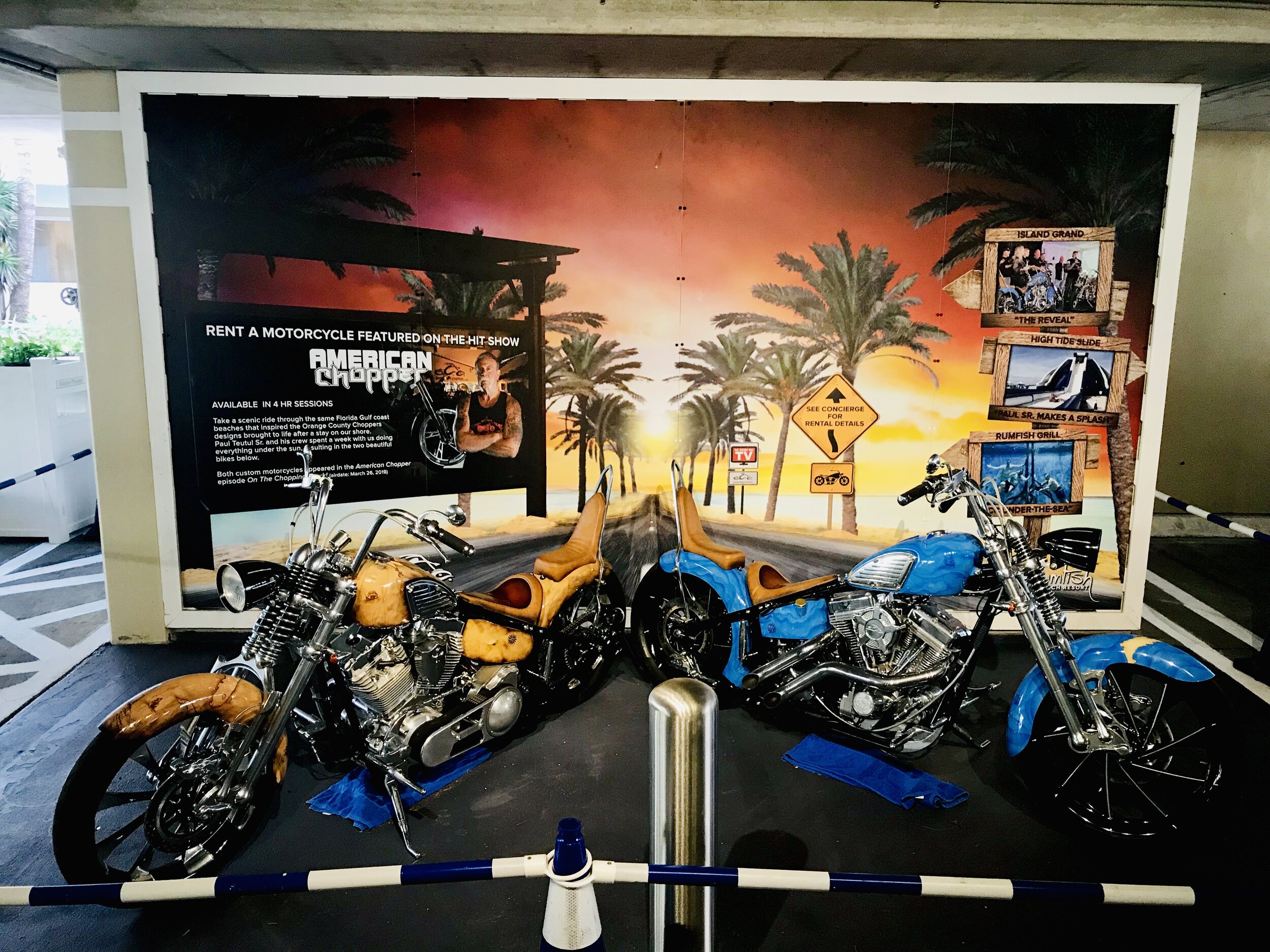
TradeWinds Island Resort did an episode on American Choppers where the OCC team designed two custom choppers for the RumFish Beach Resort. I created this photo op wall for the bikes to park in front of allowing guests to take their pics with the bikes while visiting the resort.
Garden State Yacht Sales Logo Refresh
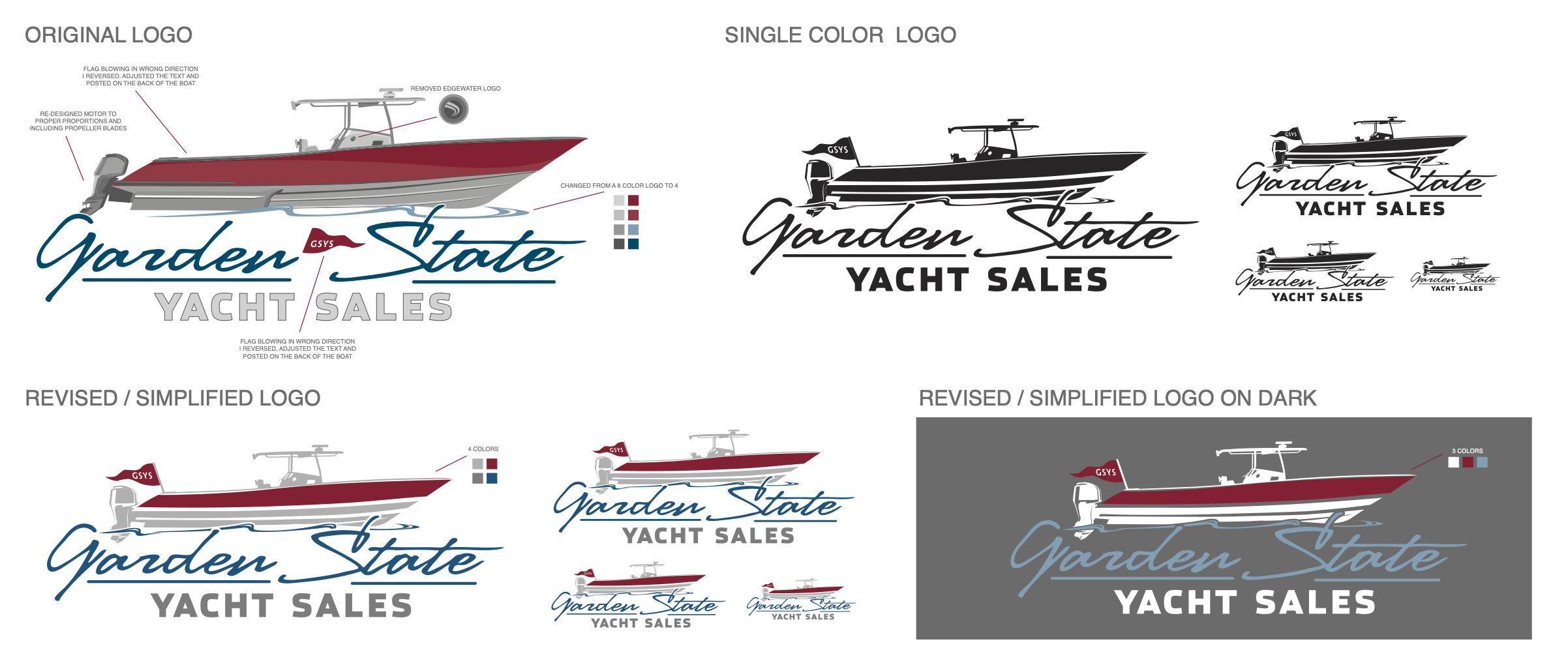
This is a logo belonging to a dealership acquired by OneWater Marine. The logo had a lot of overlapping paths, multiple colors not good for screen printing or single color use. I revised the logo cleaning up the original design. Adjusting things like the motor, the colors, removing illegal use of a brand logo within the dealer logo and creating single color variations.
The Journey Junkie Logo Design
The Journey Junkie, Allison Flavio, was in need of a new logo to take her travel/ yoga blog to the next level as it continues to grow in popularity. I did quite a bit of research on the yoga community, symbols, mantra, and the type of material Allie was writing about. This is what brought me to the end result of a simple type face logo with small symbols representing the places Allie has traveled and writes about as well as a few yoga poses including meditation. The curved rugged lines below the symbols represents the earth, tying in yoga, travel and the blog tite, The Journey Junkie.
The Journey Junkie: The Process
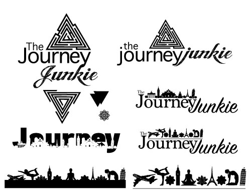
While doing my research to find the look and feel to adequately fit The Journey Junkie blog, I experimented with many shapes and imagery that related to both yoga and traveling. Some things looked nice, and some were an interesting idea but unfortunately just did not translate well once executed.
The Journey Junkie: Final Logo
This logo process presented many challenges along the way but we managed to over come them and find a light, fun design concept that spoke to the blogger. The typographic solution is fun, modern and interesting. The icons with a pop of color help this logo define what the blog is all about to a new reader without any guessing involved.
If you have never visited The Journey Junkie website now is as good of a time as any. Allie gives excellent travel tips based on her own experiences and research as well as incorporates yoga and meditation in a very unique way bringing solitude to her readers. This was a fun project and I hope it brings her many more followers in the future!
The Journey Junkie Web Banner
__________________________________________________________________
Bartender 4 Rent
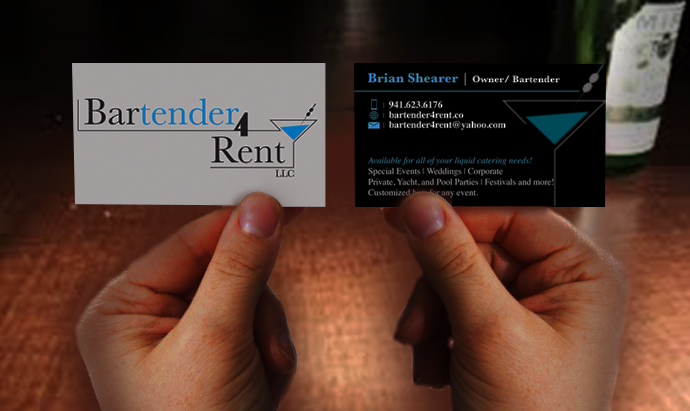
This is a new business that needed a logo, business cards and website designed and built.
The owner of Bartender 4 Rent was looking for something fresh and contemporary that would grab the attention of potential clients for his new startup business. After working through several different avenues we finally settled on this beautiful logo incorporating the use of the martini glass shape to give the logo a geometric affect.
Favicon
Bartender 4 Rent Website
When designing the website I inverted the colors of the logo to make it pop off of the darkness of the site and photography. The intent of this site design was to show this is a business that is about class and providing excellent customer service making your special event something the guests will be talking about long after the night is over.
Drink Menu Mark
I created a custom mark to emmulate the business logo for the drink menu.
Custom Booking Form
Interactive Calendar
This calendar will allow the Bartenders clients to see what days he has available without needing to call him and this allows him to focus 110% of his work and not lose perspective clients in the process.
He has total control over this calendar and it is linked to his google calendar which is entirely accessible on his mobile device. This way no matter where he is or what he is doing, the calendar on his website is always reflecting his current schedule.
Tervis® Media Insider (tmi)
The Tervis® Media Insider is an internal document used at Tervis® to inform employees on what's happening with the growth of Tervis® in the media. The news letter needed a fresh new look from the existing news letter and also needed a logo separating itself from other company news documents.
The single request from the Marketing team was that the logo be reminiscent of the TMZ logo.
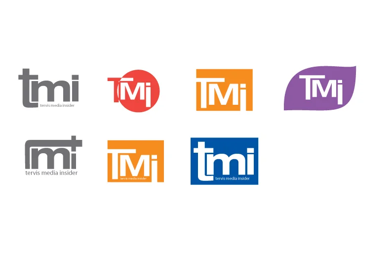
This logo was the most successful because of it's simplicity, symettry and interesting treatment to the typography while keeping it within the Tervis® brand guidelines.
Tervis® Media Insider (tmi)
The first group of sketches I played with various color combinations using the Tervis® color palette as well as ligatures using helvetica keeping it within company brand guidelines.
Tervis® Media Insider (tmi)
The second group of sketches I focused more on using a single color and adding shapes to the logo as well as making a shape using the logo.
Wallow Sound: Alternative Rock Band
Wallow Sound is a local band in Port Charlotte Florida. Although they have been in the area for more than 15 years performing, they have been performing together under the name Wallow Sound for 2 years and already they are developing a large following. Wallow Sound are a Hard Rock/ Alternative/ Indie Rock/ Alternative Pop-Rock group. Their audience/demographic ranges from men and women 18-40.
Wallow Sounds Sketches
I started out this project by researching the band, listening to their music and trying to find what it is they stand for before I started sketching.
Wallow Sound Digital Sketches
Wallow Sound Album Cover
I hand painted numerous textures and merged them together in Photoshop to create the album cover that went to print.
Wallow Sound Album Cover
Wallow Sound Ladies Tank
The band logo wraps from the front all the way around the left side to the back.
Wallow Sound Mens T
Wallow Sound Band Posters
Using some of the hand painted textures I initially created I merged them together to create multpple band poster options for their use.